How do colour-blind people see the world?
If one is going to make an algorithm for distributing attention over an image, it has to be done properly, which means that determining the “strength of colour” becomes vitally important.
Colour perception
The sensation of colour depends on the signal that arrives in the brain from the S, M and L cones. At the same time, some colours distinguished by a person are sensed by several kinds of cones at once, and it is precisely because of this that some colours seem brighter than others that are identical in hue and saturation.

It is interesting — what would colours look like if the strength of their perception were the same as their saturation? Answering this question, I wrote a little program illustrating the relationship between colour and perception. And here are the results of its work:
Colour target: original, post-processing.
Another colour target: original, post-processing.
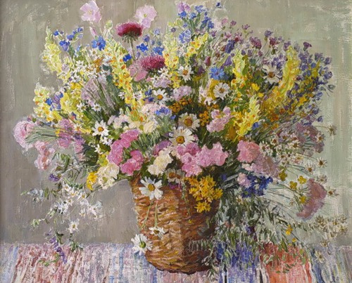
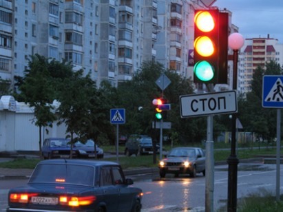
But the images given show the result only for full colour vision. It is interesting — and how do colour-blind people look at the world?
Colour blindness
And colour-blind people come in different kinds: colour blindness arises mainly from a shortage of cones of a particular type. In the case of a shortage of cones of two types, colours are not distinguished at all; the world looks monochromatic, as in a black-and-white photograph. But in the case of a deficit of cones of one of the types S, M or L, a situation arises in which certain colours cannot be distinguished.
Let us try to model, on the basis of data on the colour sensitivity of the cones, the perception of colour-blind people!
I honestly admit that these models are not calibrated. Ideally, a colour-blind person should not sense any substantial difference between the original and the result of the modelling. But for the sake of being able to imagine how — it is curious, after all? :)
In the pictures are images after normalisation of the strength of colour perception. The targets and screenshots are mine, and the photographs were taken from sites here, here and here.
Originals:
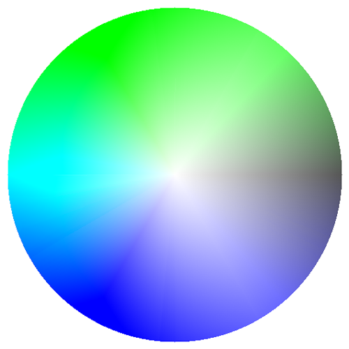
Shortage of L cones (indistinguishability of red):
(simulations in the original post)
Deficit of M cones (indistinguishability of green):
(simulations in the original post)
Absence of S cones (blue and violet not seen):
(simulations in the original post)
In my view, people with an indistinguishability of blue shades have the easiest time of it in everyday life. It is far more difficult for those who cannot distinguish red. Traffic lights, road signs and warnings often turn out to be unnoticed.
P.S.
Having received, after writing the post on vision modelling, several requests to show the program, I decided to make a simple web service of the type “you upload a picture > you get the result”. In connection with this I began rewriting the program that generates the dynamics. I welcome suggestions as to how this should look.