A Treatise on the Power of Colour
What is the strength of colour perception?
Let us talk about the strength of the perception of colour. In previous posts I have already told how some colour hues are perceived by consciousness as stronger, brighter, than others.
Technically this is connected with the strength of the signal that arrives in the brain from the S, M and L cones: hues close to yellow are perceived simultaneously by the S and M receptors, and hues close to red-violet (magenta) — by the M and L.
The brightest hue by perception is red-orange; a little less bright are the yellow-green and red-violet hues. The clear outsiders are the blue and azure hues: in intensity they are 3.5 and 5 times weaker than the brightest hue.
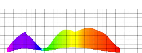
I have created a little diagram illustrating the strength of colour perception:

On the diagram the brighter colours are on the left, the less bright on the right. To emphasise the level of perception, the less bright hues have been specially darkened.
Naturally, in disorders of colour vision the brightness of colour perception changes. Here is what happens in the case of protanopia (a disorder of the perception of red):
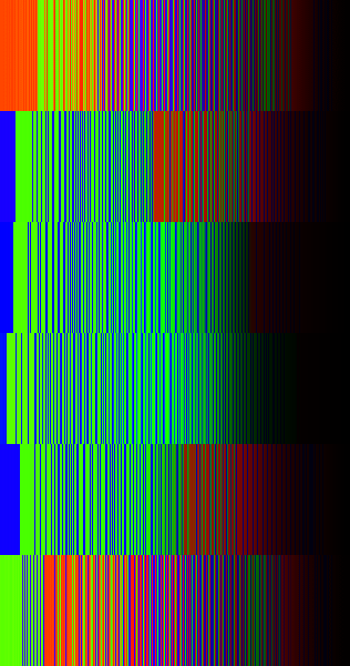
In the case of deuteranopia (a deficit of green):
And of tritanopia (the indistinguishability of blue):
How is this used in design? The triad scheme for choosing a colour palette.
For creating colour schemes for websites (and in life in general) the “triadic colours” approach is widely used. The essence of it is this: one takes a colour circle (obtained with the help of the HSL model)

And an equilateral triangle is placed upon it. As this triangle is rotated about its centre, its vertices point to harmonious colours. In theory, the sum of these three colours, taken in equal proportion, ought to give white.
Two triadic colours of identical brightness, placed one upon the other, ought in theory to possess an identical strength of perception. Therefore, if a rectangle of one triadic colour is placed against a background of another, the eye will at any one moment see either the frame or the figure.
As a consequence — an excellent opportunity to make frames for photographs or objects on a page such that the photograph is perceived without the frame, and not as a single whole with it, as happens when the frame is made of a neutral colour.
Two more examples of frames from triadic colours.
Problems of triad selection
But let us analyse this colour circle from the point of view of the strength of colour perception! Let us take a circular colour target and light up the colours on it, in order to see whether colours taken with the help of an equilateral triangle will form a harmonious triad:
On the left is the original colour circle, on the right the result of the processing. On the right-hand circle, for the stronger colours, saturation (the expressiveness of the colour) has been artificially increased. Click to see the pictures in an enlarged view; several more colour targets can be viewed here.
Let us mentally place an equilateral triangle so that one of its vertices falls on the maximum of yellow. And what do we see? — That the colours lying at the ends of the triangle, taken in equal proportions, do not add up to white! Or, more precisely, the sum of these colours will have a tint shifted toward the brighter hues.